

Components
Reusable building blocks for business applications.
A reusable React design system for cohesive application interfaces, from form controls and navigation to complex content, charts and theming.
Reusable building blocks for business applications.
Consistent inputs, labels and validation patterns.
Light, dark and accent-colour foundations.
Interfaces for information-rich product experiences.
OPUS React is a component-led approach to building applications. Its visual foundations and interaction patterns are intended to help different screens feel related, even as products grow in complexity.
The project covers a broad range of interface needs, including inputs, overlays, content components and data visualisation. The live component catalogue lets visitors explore the system directly, while the showcase below pairs the real interface with the approved OPUS presentation.
Explore OPUS live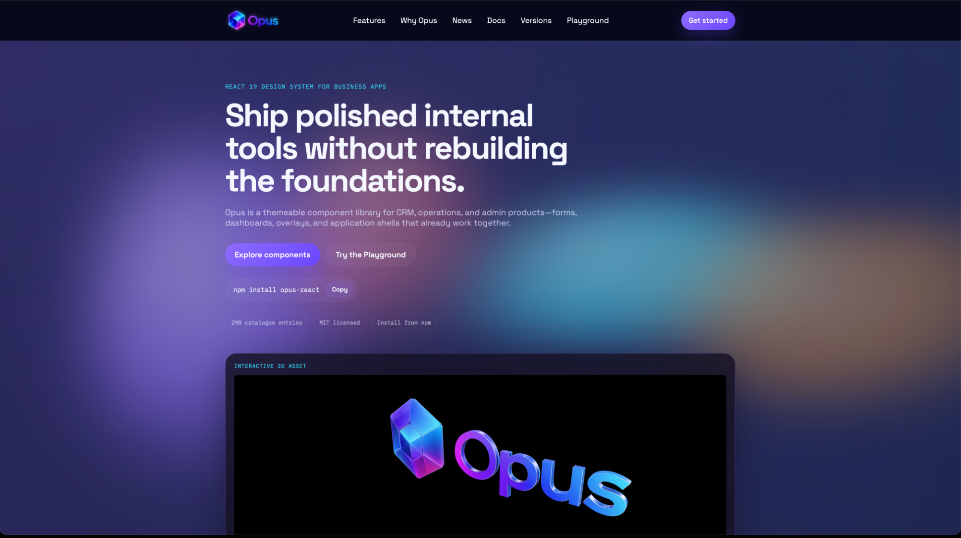
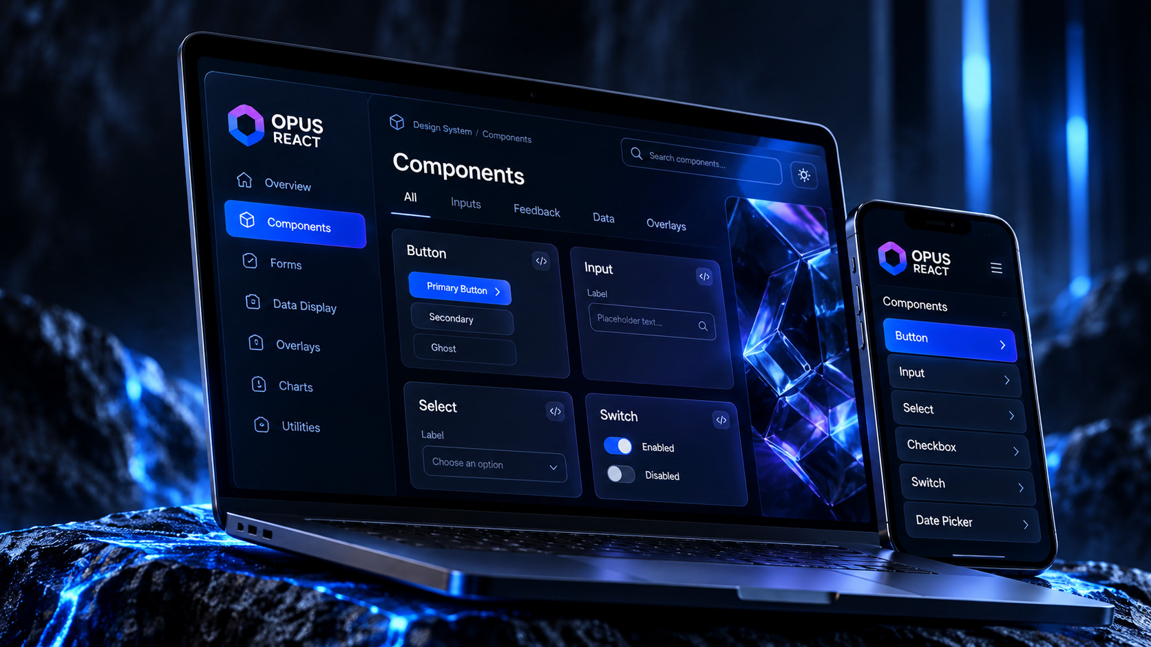
OPUS React explores the patterns that make complex application interfaces feel connected: from typography and forms to content and data display. Consistency is a product decision as well as a visual one.