REACT COMPONENT LIBRARY DEVELOPMENT
Reusable React components for real product teams.
Build a maintainable component library that turns product patterns into dependable, accessible and reusable application building blocks.
IMPLEMENTATION LAYER
A component library should make the right thing easier to build.
Reusable React components are valuable when they capture more than styling. The useful layer includes behaviour, states, accessibility expectations and the small implementation decisions that otherwise get repeated across a product.
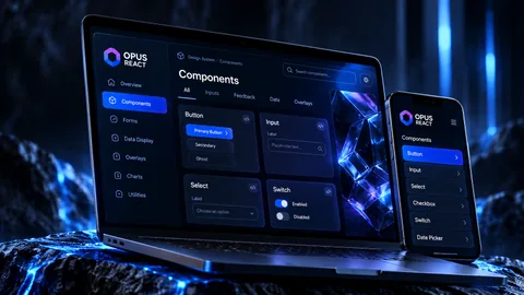
Kinetic Axis owns and develops OPUS React, a published React component library for business applications. You can inspect its npm package, source and live component catalogue through our OPUS page. For client projects, we shape the component API around the workflows, data and interaction patterns the product actually needs.
How we design and buildCOMPONENT LIBRARY CAPABILITIES
A usable system from primitives to complex patterns.
The right level of abstraction matters: enough reuse to improve consistency, without making every future requirement fight the component API.
Core primitives
Buttons, inputs, layout, typography and state foundations with predictable behaviour and composition.
Complex form controls
Validation, labels, errors, disabled states and field patterns designed for business workflows.
Application patterns
Navigation, overlays, data display and content structures that reflect how the product is actually used.
Developer documentation
Clear examples and usage guidance so the library becomes a delivery tool rather than an internal showcase.
WHERE IT PAYS OFF
Reduce repeated UI work without freezing the product.
A component library is most useful where several screens, teams or products share interaction patterns.
SaaS platforms
Create common product primitives while leaving room for feature-specific workflows.
Back-office systems
Standardise dense forms, tables, filters and operational actions across complex applications.
Multi-product estates
Share interface behaviour across related products without duplicating core UI decisions.
Product modernisation
Replace inconsistent legacy widgets with a maintainable React implementation layer in stages.
HOW WE APPROACH IT
Make the workflow clear before the software gets complicated.
We start with users, operations and outcomes, then design the smallest coherent system that can grow with the business.
Understand the workflow
Map users, decisions, data, hand-offs and exceptions before deciding what the software should look like.
Define the product shape
Separate the core outcome from useful extras so the first release is coherent rather than over-scoped.
Design and integrate
Build the interface, data model and integrations together so the product behaves as one system.
Release and evolve
Use real operation and customer feedback to decide what should be improved, automated or expanded next.
RELEVANT WORK
Experience behind the recommendation.
Selected work showing the same kind of product, workflow or platform thinking in practice.
RELATED EXPERTISE
Connected problems usually need connected thinking.
These related capabilities often sit alongside the work on this page.
EXPLORE
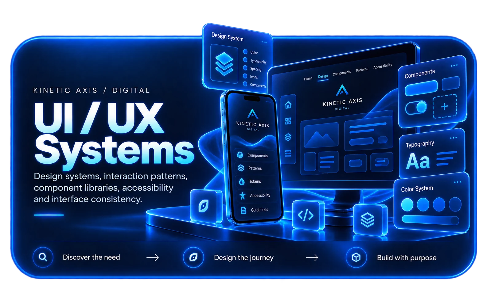
Design system development
Connect component implementation to a wider set of visual and interaction rules.
View capability EXPLOREEnterprise UI development
Apply reusable patterns to dense, high-frequency operational interfaces.
View capability EXPLOREWeb app development
Build complete browser-based products around the component system.
View capabilityCOMMON QUESTIONS
Useful things to know.
Is a React component library the same as a design system?
Not exactly. A component library is the implementation layer; a design system also includes the visual, interaction and usage rules that guide how those components should be applied.
Can you build on top of an existing library?
Yes. We can extend or rationalise an existing implementation where that is more useful than replacing it.
How do you avoid over-engineering components?
We start from repeated product patterns and real use cases, then abstract only where reuse creates a clear benefit.
Can components support accessibility requirements?
Yes. Keyboard behaviour, focus, labels, states and semantic structure can be built into reusable components so teams do not solve the same accessibility problems repeatedly.
Who will I work with?
Kinetic Axis projects are senior-led. Discovery, product decisions and engineering direction stay close to the people doing the work, with direct communication throughout the project.
What happens after launch?
The post-launch model is agreed around the product. Handover, hosting responsibilities, documentation, monitoring, support and further development can be planned before release so there is a clear next step.
WORKING WITH KINETIC AXIS
Senior thinking stays close to the work.
Good delivery is not just the build. It is making the important decisions visible, agreeing responsibilities early and keeping the product useful after launch.
Direct technical and product input
Discovery, design and engineering decisions stay close to the people doing the work rather than passing through layers of account management.
Clarity before commitment
We work through users, workflows, integrations and risk before turning a broad idea into a technical commitment.
Responsibilities agreed up front
Handover, hosting, support, documentation and ongoing development are discussed as part of the project rather than left until launch week.
Useful after launch day
Decisions are made with maintainability, real users and future change in mind — not just how the first release looks in a presentation.
START A CONVERSATION
Need a React UI foundation your product team can actually reuse?
Share the journeys, screens or design-system problems you want to improve and we can work through the right next step.