

Discover
Make finding something brilliant part of the experience.

An expressive digital marketplace built around finding interesting products, browsing categories and bringing buyers and sellers together.
Make finding something brilliant part of the experience.
Give different types of products room to shine.
A recognisable visual language across the platform.
A browsing experience across screen sizes.
The eBuyGum project brings marketplace functionality and a bright, expressive visual style together. From the brand itself to category browsing, the design aims to make exploring products feel inviting and easy to navigate.
The portfolio imagery presents the approved design direction, including desktop and mobile compositions.
Explore eBuyGum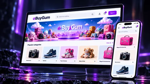
eBuyGum shows how marketplace structure and visual identity can support each other instead of treating brand, categories and product browsing as separate layers.
The experience is designed around exploration as well as direct product lookup, giving discovery a clear role in the marketplace journey.
Distinct category presentation gives very different types of products room to feel relevant without fragmenting the wider brand.
Logo, typography, colour and campaign artwork create a consistent identity across the shopping experience.
Layouts and product discovery are considered across desktop and mobile rather than treating smaller screens as a reduced afterthought.
The product needs to support browsing, listing structure and the interactions that bring buyers and sellers into one digital environment.
A consistent set of visual and interaction patterns gives the marketplace a stronger foundation as categories and features expand.
For a marketplace, visual identity and product journeys need to work together. eBuyGum illustrates how category presentation, branding and website design shape a coherent digital storefront.
eBuyGum is shaped around browsing and discovery. The work combines a recognisable visual identity with category-led exploration and responsive presentation so the marketplace feels like a product rather than a generic catalogue.
A concise view of how the finished product is shaped. The result statements describe the product shown here, not unsupported commercial metrics.
A marketplace with varied categories needs to help people browse and find interesting products without becoming a generic catalogue of disconnected listings.
Browsing, category entry points and visual identity were treated as core product behaviours rather than decoration around search and checkout.
Navigation, category presentation, branded artwork and responsive layouts work together as a repeatable marketplace structure across screen sizes.
The brand is expressed through banners, category artwork and interface presentation so the marketplace feels recognisable wherever the customer enters.
The result is a responsive ecommerce experience where discovery, categories and identity reinforce one another instead of competing for attention.
The experience gives finding interesting products a clear role rather than reducing the journey to search and checkout alone.
Category-led navigation gives very different product types a clear route into the marketplace experience.
The eBuyGum identity carries through banners, category artwork and interface presentation instead of sitting separately from the product.
Desktop and mobile compositions keep the discovery-led direction coherent as the available space changes.
A practical view of the decisions behind the finished work, based on what is shown in this case study.
Treat discovery as a primary marketplace behaviour rather than forcing every journey through search and checkout.
Give different product families clear entry points while maintaining a recognisable marketplace hierarchy.
Category artwork, banners and interface presentation use the same identity so the marketplace feels coherent rather than templated.
Responsive compositions preserve hierarchy, browsing and visual character as the available space changes.
Concrete product, interface or system decisions shown in the case study — without invented performance claims.
The project combines category-led discovery, browsing and product presentation across screen sizes.
Marketplace structure and bespoke category artwork use the same visual identity rather than feeling bolted together.
The experience gives browsing and finding products a deliberate role in the product journey.
What this demonstrates: eBuyGum demonstrates how marketplace UX and brand design can reinforce each other when discovery is treated as a product problem.