
Start with the product, not a component checklist
A design system should emerge from the product patterns teams actually repeat. Auditing current screens reveals where inconsistency creates friction and where reuse would make delivery easier.
That usually produces a smaller and more useful first system than copying a generic inventory of buttons, cards and controls.
- Audit repeated workflows and interface states
- Identify inconsistent decisions that cause delivery or usability problems
- Prioritise components with clear reuse across several product areas
Separate foundations from components
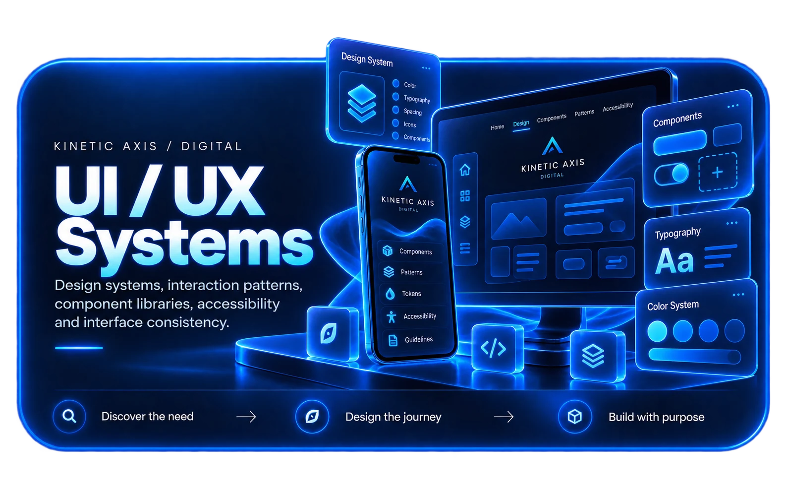
Foundations describe the visual and behavioural rules that many components share. Components turn those rules into repeatable interface building blocks.
Keeping the distinction clear makes it easier to change typography, colour, spacing or themes without rewriting every product surface independently.
Design for states, not screenshots
Real components need hover, focus, disabled, loading, validation, empty and error states. Those behaviours are part of the system, especially in business applications where edge cases are common.
Accessibility also belongs here: labels, keyboard behaviour, focus order and semantic structure should be treated as reusable decisions.
Avoid abstraction before evidence
A component that tries to support every theoretical variation can become harder to use than duplicated code. Start with proven patterns and expand the API when another real use case appears.
This keeps the system flexible without turning it into a framework inside the framework.
Plan ownership and contribution
A design system needs a way to evolve. Teams should know who owns foundations, how changes are reviewed, and how product-specific needs become shared patterns when reuse is justified.
Without ownership, teams often create local overrides until the system stops being a source of truth.