
Why build your own library.
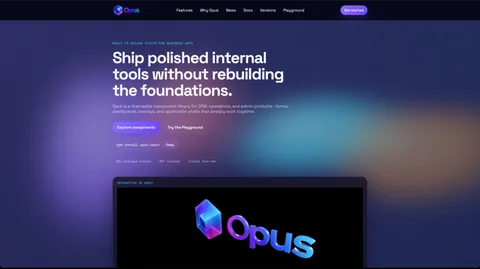
Every serious React project re-solves the same problems: consistent form controls, data tables, navigation, focus management, theme tokens. Solving them once, well, is cheaper than solving them ten times with three different conventions — so OPUS exists to be that solved-once system.
Architecture first.
Development began on 5 July 2026 with the component catalogue: the shared foundations that every interface built on the system inherits. Components are written in TypeScript, keep accessibility behaviour inside the component itself, and stay composable enough to assemble complex, data-rich enterprise screens without bespoke one-offs.
Documentation and packaging.
During July the work extended to npm package documentation and publishing, so the library can be installed rather than copied. A component library without real documentation drifts; the catalogue keeps usage, props and behaviour discoverable.
Tokens over overrides.
The design decision that pays for itself daily: components accept design tokens — spacing, colour, elevation, state — rather than bespoke props for every visual exception. A one-off look is expressed as data, never as a style patch pasted onto a component that then haunts every other page using it.
That keeps the library opinionated without being inflexible, and it gives designers and developers a shared vocabulary: what is negotiable is visible and typed, and what is fixed is genuinely stability.
Accessibility as the default, not the audit.
Every component ships with its accessibility contract built in — roles, focus order, keyboard affordances and announced feedback — so a team consuming the library inherits correct behaviour without expertise it may not have.
TypeScript carries the same weight: strict types make the safe path the easy path, and misuse is caught at compile time instead of in a browser console or, worse, a client review.
Why we do not chase every feature.
Component libraries die by ambition: each new bespoke requirement bolts on a prop, a style variant, a behaviour flag, until every component is a config panel nobody can predict. OPUS stays deliberately small-surfaced. When a visual difference is genuinely needed, the token system absorbs it; when behaviour differs, composition is the answer — not another switch inside a box.
Restraint here is not stinginess; it is the discipline that keeps a library maintainable for years. Every feature rejected at the boundary is a bug class, a test matrix row and a documentation page that will never need to exist.
Versioning without drama.
A component library only earns adoption if teams are not afraid of its version numbers. OPUS follows disciplined semantic versioning: breaking changes are rare, announced and accompanied by honest migration notes; the deprecation path is gradual rather than a cliff; and the changelog reads like a history the team actually wrote on purpose.
The effect on consuming projects is cultural. Upgrades are routine events rather than risk assessments, so projects actually upgrade — which is the difference between a living library and a fossil.
The test suite that keeps promises.
The component suite runs tests that check the things that matter most silently: rendering paths, interaction behaviour, focus management and announced states. Those assertions are why the accessibility contract survives refactors — the suite notices when a change breaks the contract.
Team members joining a project inherit components they can trust without reading their source. That is the real product of the testing discipline: confidence that behaves like a checksum on every release.
Where OPUS earns it daily.
The proof of a component library is the second project. Building once proves the idea; reusing across successive builds proves the economics — interface consistency arriving free, review cycles shortening because familiar components need less scrutiny, and new work beginning at speed without re-deciding what a button is.
OPUS is now the studio's default starting point for React interfaces, which has a compounding effect on quality: every fix made for one project makes the next project's baseline higher, and every edge case encountered anywhere becomes a permanent improvement everywhere.
What this demonstrates.
For clients, this expertise means faster delivery with less variance: interfaces stay consistent, maintenance is centralised, and new screens start from proven parts instead of blank files. It's the difference between assembling software and rebuilding it.